
← All work
Facts Deck

Case study · FinTech publishing

Straightforward finance, clearly explained — then calculated.

Financial literacy where articles, calculators, polls, and quizzes feel like one continuous product — not separate tools stitched together.

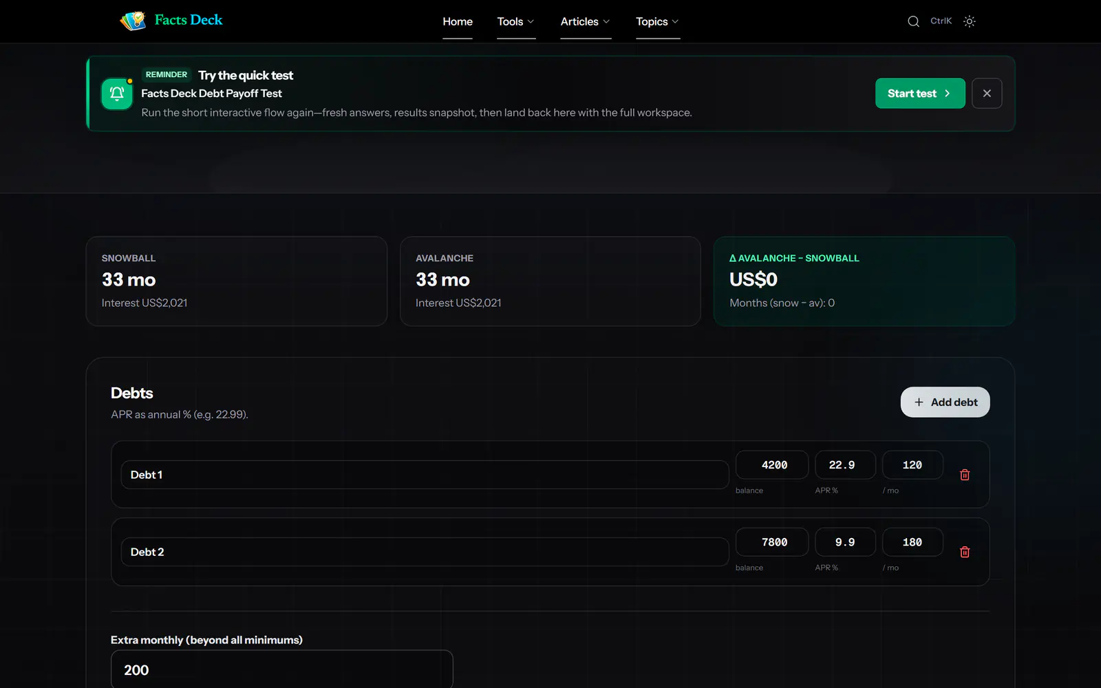
Debt Payoff Planner workspace in dark mode
03 · Calculate
Knowledge quiz open over a Facts Deck article
02 · Engage
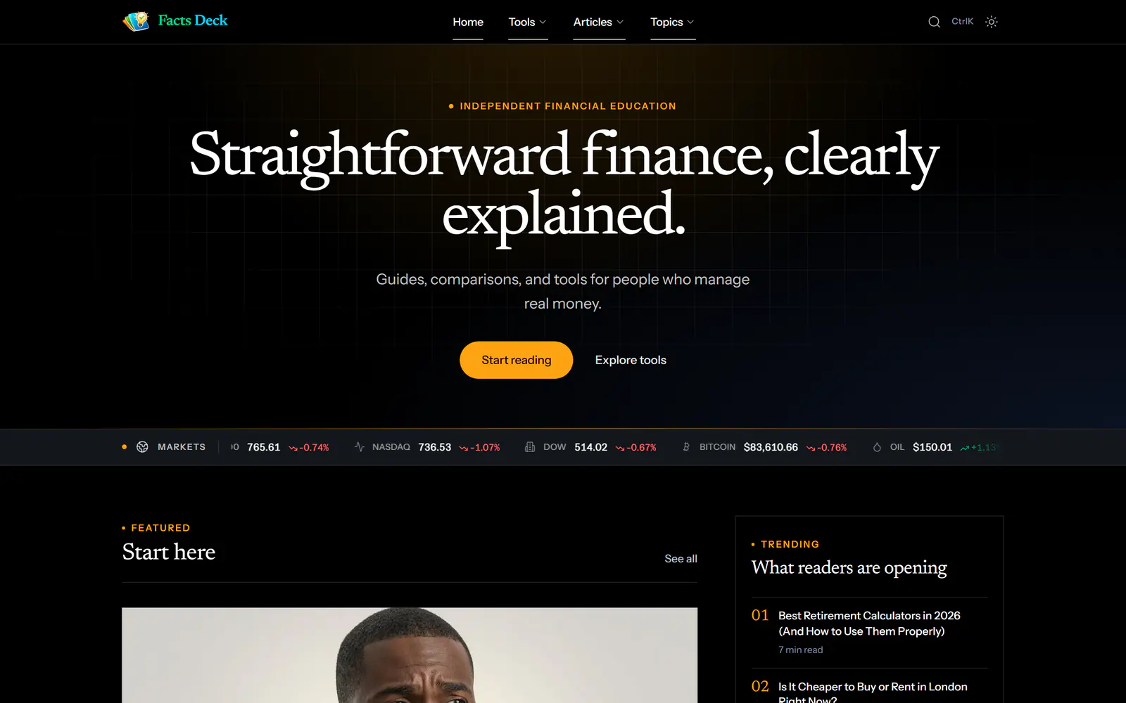
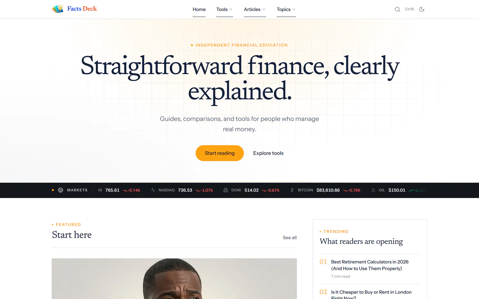
Facts Deck homepage
01 · Read
  • Facts Deck
  • Articles80+
  • Tools12
  • Topics13
  • Quiz1–5 Qs
  • Poll1 / post
  • ThemesLight · Dark
  • Editors1
  • StackNext.js · Supabase
FinTech · PublishingProduct design

Finance sites made people choose.

Either a dense article written to rank, or a calculator dropped on a page without enough context to make its answer useful.

5 min read2026 Live
MG

Michael Genesis II

Sole builder

Key takeaways

  • One product, three systems: a finance publication, 12 calculators, and article-level polls and quizzes.
  • Every tool shares one interaction model — quick journey, result summary, then a full workspace.
  • Polls and quizzes open in a shared modal inside the article, so the reading flow never breaks.
  • Light and dark themes run across the publication and every tool.
  • A purpose-built admin studio lets one person write, place, configure, and measure everything.

At a glance — what went into it

DetailValue
Year2026
RoleSole builder — product design, frontend, backend, and content architecture
StatusLive
StackNext.js · Supabase · Node.js · Transactional email
Live atfactsdeck.com

Most finance sites make readers choose between a dense SEO article and an isolated calculator with no context. FactsDeck makes reading about a financial idea and testing it against your own numbers two steps in the same experience.

Not merely functional. Effortless.

The product

One publication. Three connected systems.

FactsDeck closes the gap between learning about money and acting on what you learn. It combines a structured financial publication with 12 calculators and planners, article-level polls and quizzes, and an editorial system designed for a one-person team.

01

Read

A structured finance publication with editorial judgement across investing, banking, real estate, retirement, credit, and more.

02

Calculate

Twelve tools that share one learned pattern: quick journey, result summary, then a complete analytical workspace.

03

Engage

Contextual polls and graded quizzes that turn passive reading into a moment of reflection and proof.

Inside Facts Deck

Read, reflect, prove it — without leaving the page.

Captured from the live site. Step through one article the way a reader meets it.

Lead with the number

Headlines and deks put the real figure first. The poll and quiz entry points sit in the article hero, before a single paragraph is read.

1/5
factsdeck.com/post/10000-loan-real-cost
Facts Deck article page with poll and quiz buttons in the hero

In your pocket

Same product at 390 pixels wide.

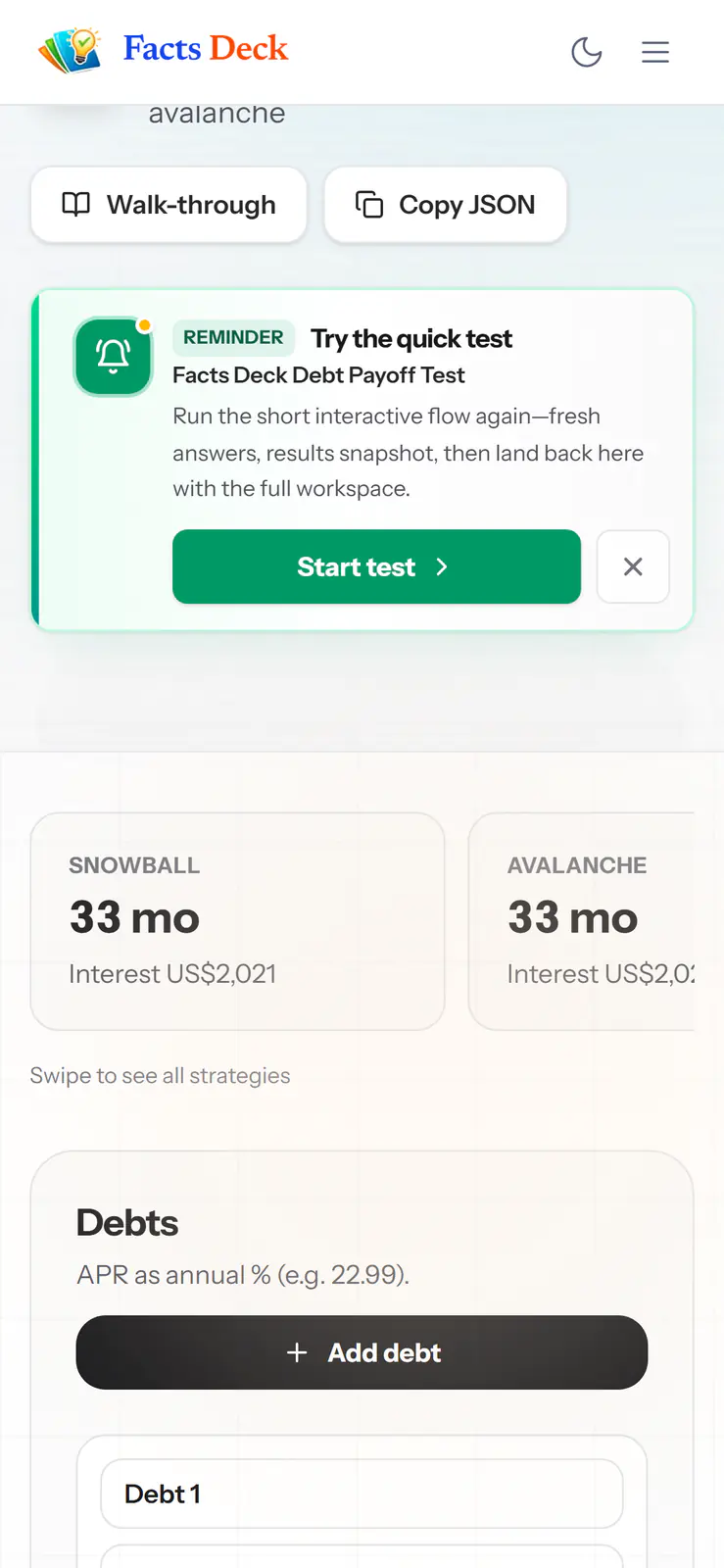
Every surface was designed mobile-first — including swipeable KPI cards and bottom-sheet modals.

  • Facts Deck mobile — Home

    01Home

    Editorial hero and live ticker

  • Facts Deck mobile — Article

    02Article

    Poll and quiz one tap away

  • Facts Deck mobile — Quiz · Dark

    03Quiz · Dark

    Shared modal, dark theme

  • Facts Deck mobile — Workspace

    04Workspace

    Swipeable strategy cards

One mental model

Learn one. Use all twelve.

Different mathematics underneath; the same predictable journey on top. Here is the Debt Payoff Planner, end to end.

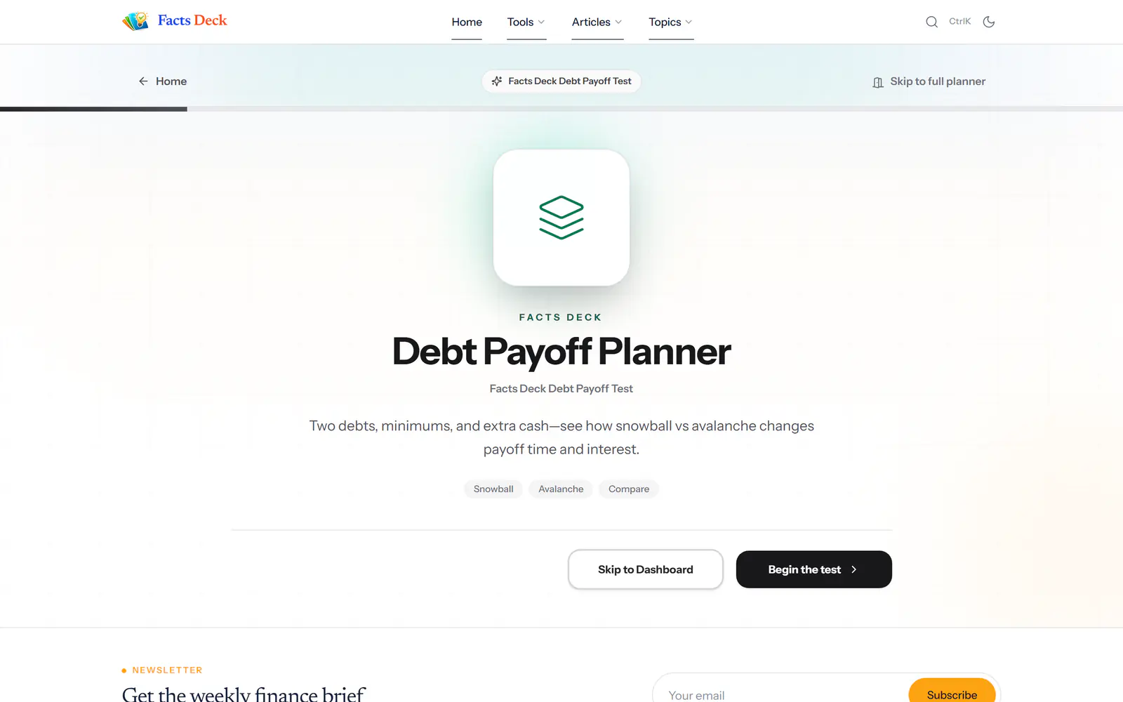
  1. Debt Payoff Planner — Intro

    Step 01

    Intro

    One screen explains what the tool answers, with a choice: take the test or skip to the dashboard.

  2. Debt Payoff Planner — Quick test

    Step 02

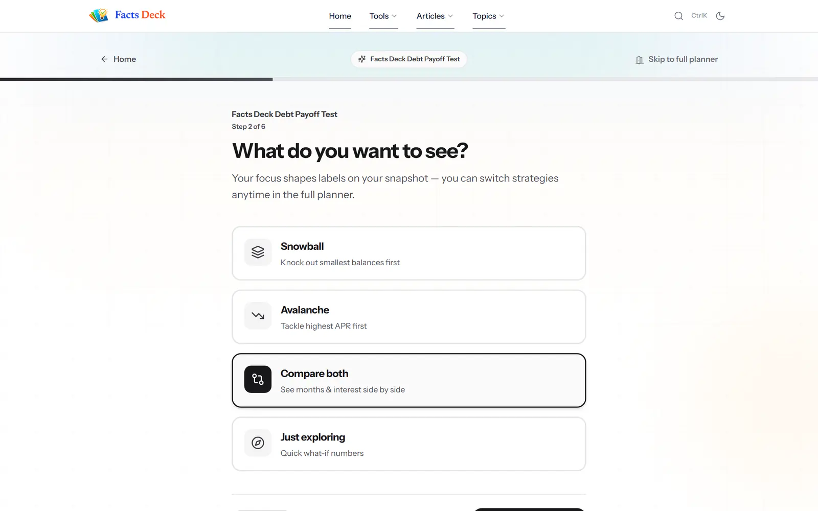
    Quick test

    Six short steps collect only what the result needs, with a progress rail across the top.

  3. Debt Payoff Planner — Walk-through

    Step 03

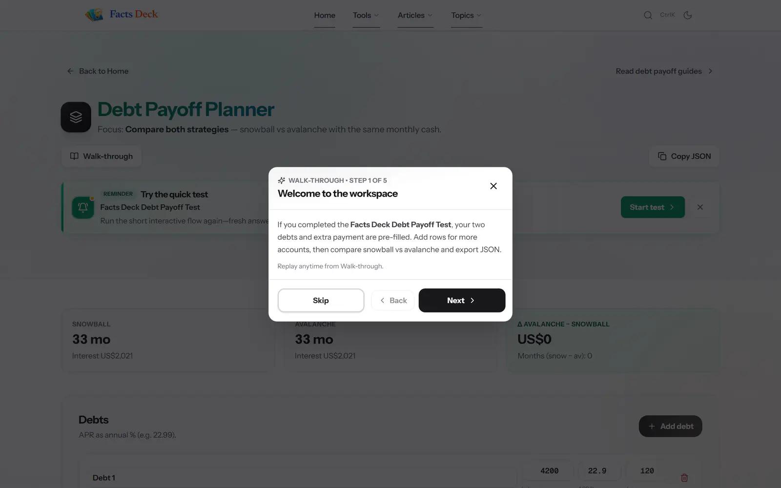
    Walk-through

    Landing in the workspace starts a five-step tour that can be replayed any time.

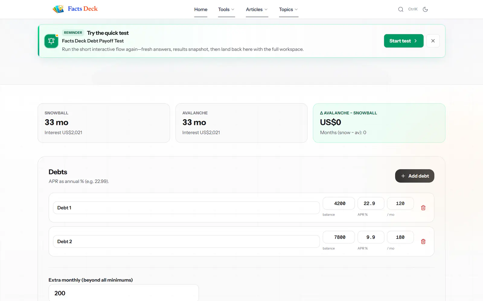
  4. Debt Payoff Planner — Workspace

    Step 04

    Workspace

    KPI cards summarise the answer; the full planner underneath lets readers push every number.

Under the interface

Three decisions that shaped the system.

  1. 01

    jsonb over fixed engagement tables

    Polls and quizzes could evolve without migrations. The trade-off was explicit application-layer validation and a read-time fallback for legacy content.

  2. 02

    Consistency over tool-specific complexity

    Mortgage amortisation and staking yields differ underneath, but readers should not have to relearn the interface each time.

  3. 03

    Engagement inside the article

    The shared poll and quiz modal keeps the sequence intact: read, engage, understand the result — without sending attention to another page zone.

The bottom line

What building it taught me.

Lesson 01

Effortless is cumulative

A product feels effortless because dozens of small interaction decisions agree with each other — not because of one standout feature.

Lesson 02

Data flexibility is a loan

jsonb accelerated interaction design, but the application inherited the work of defining validity and cleaning up data when those rules changed.

Lesson 03

The CMS and public UX are one system

A one-person product remains consistent only when the tools used to publish it are held to the same standard as the experience readers see.

See it in production

Read something. Run the numbers.

Free articles and calculators — no account needed.

factsdeck.comVisit
Independent financial education.← All work